
This picture originally started as a painting, and turned into pop art, this was also an add for the soup. I like this picture as it has many different colours yet still looks balanced, although the image is filled it is still clear and pleasing for the eyes.
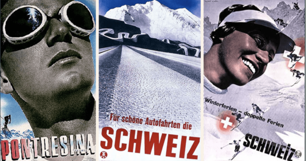
Herbert Matter was a master of using photomontage, colour and typography in an expressive manner, transcending the boundaries between art and design. His design work often favoured a heavy use of photography. His most recognisable works are the posters he created for the Swiss Tourist Office, but his photography work for Harper’s Bazaar, under the direction of Brodovitch, is equally impressive.
